How to Make Ten Food Photos Look Like One Brand
1 August 2026 · 4 min read
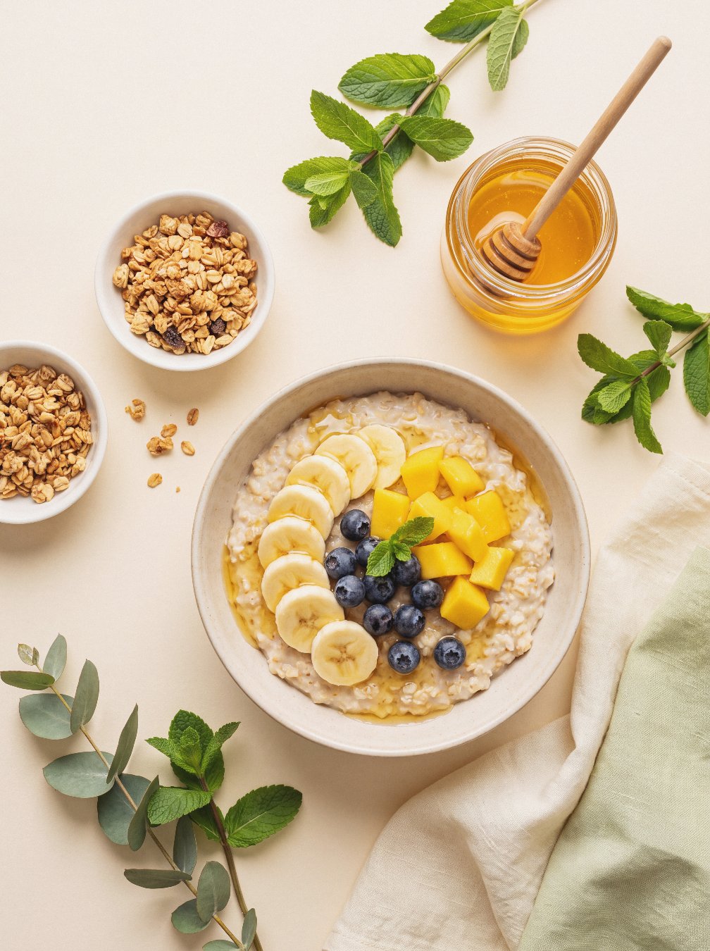
You have felt it without being able to name it. You open your own grid — nine photos you were proud of one at a time — and something is off. Each frame is fine. The bowl is beautiful. The light is soft. The styling is careful. And yet the whole thing reads as a pile rather than a body of work. Nice, but scattered. The frustration is quiet because there is nothing obviously wrong to point at, which is exactly what makes it so hard to fix.
Here is the counterintuitive part. The eye reads cohesion before it reads content. When someone lands on your profile, they do not first admire your composition or notice that you shot the porridge at the perfect angle. They take in the grid as a single field of colour and light, and they decide — in well under a second, before conscious thought — whether it holds together. Content is what they judge second. Cohesion is what they feel first. A scattered grid tells a viewer this person is improvising, no matter how good any single image is. A cohesive one says this person has a point of view. That signal is your brand, and it is transmitted faster than any caption you will ever write.
The good news is that cohesion is not a talent. It is a checklist. Here is the one I use.
The Three-Match Rule
Before you post two images beside each other, ask whether they share three things. One light temperature. One colour season. One prop and surface language. If a pair fails two of the three, the two images do not belong in the same grid — however lovely each is alone.
One light temperature. Every photo carries a temperature, and warm and cool do not mix without a visible seam. Morning light through a window is warm and low and long — it turns cream into butter and casts soft, directional shadows. Midday overhead light is cool and flat and even, closer to a bright studio. Both are correct. Both photograph food well. But a warm morning shot sitting next to a cool midday one reads as two different kitchens, two different days, two different people. Pick one temperature per feed and commit. Most food coaches suit warm — it flatters skin, wood, and anything roasted — but the choice matters less than the consistency.
One colour season. Beyond temperature, every palette belongs to a family. Muted, earthy, low-saturation tones — sage, oat, terracotta, clay, dusty rose — form one world. Bright, saturated primaries — pillar-box tomato, egg-yolk yellow, glossy green — form quite another. A photograph of a beige grain bowl on a stone plate and a photograph of a rainbow smoothie in a clear glass can both be excellent, and they will still fight when placed together, because they are speaking different colour languages. Choose your season. If your brand is calm, gut-friendly, considered, you almost certainly live in the muted family, and the loud primary shot — good as it is — is a visitor from someone else's account.
One prop and surface language. Props and surfaces are the quiet third that people skip, and it is often what breaks a feed. Linen napkins, matte stoneware, raw wood, unpolished ceramic — that is one vocabulary. Glossy white studio tabletops, chrome cutlery, bright plastic, high-shine backdrops — that is another. Even your hands count: bare wrist and rolled linen sleeve is not the same register as manicured nails on a lacquered surface. Decide which materials appear in your world, and let the rejects sit out.
Fail one match and the pairing usually survives. Fail two, and the images do not belong together. That is the whole rule.
A 60-second self-audit
Do this now, before you close this. Open your last nine posts. Pick the image that feels most you — the truest one — and make it the reference. Now hold each of the other eight against it and score, fast, on the three matches: same temperature, yes or no; same season, yes or no; same prop language, yes or no. Do not overthink; your first instinct is the correct one. Any image scoring one out of three is what is breaking your feed. You will usually find two or three culprits, and they are almost never the photos you would have guessed.
What to do with the ones that fail
Do not delete them. They are good photographs; they simply belong to a different room. Retire them from the grid and keep them for stories, where cohesion does not apply because nobody views stories as a mosaic. From now on, run the three checks before anything joins the permanent feed. Within a few weeks the grid tightens on its own, and the nice but scattered feeling quietly disappears.
One shortcut worth knowing: a set of images shot as a set — one temperature, one palette, one prop world from the start — passes all three checks by construction, which is the entire reason matched sets exist.